Ambleway
A trip planner for independent travellers. It replaces saved posts, map pins, notes and a dozen open tabs with one day-by-day plan.
The challenge
People already plan trips, just badly and in six places at once. Ideas live in saved posts, pins across several map apps, a notes file and a wall of open tabs. Nothing connects them, so the work of turning inspiration into an actual day-by-day plan falls on the traveller at the worst possible moment.
The approach
- 01
Name the mess first
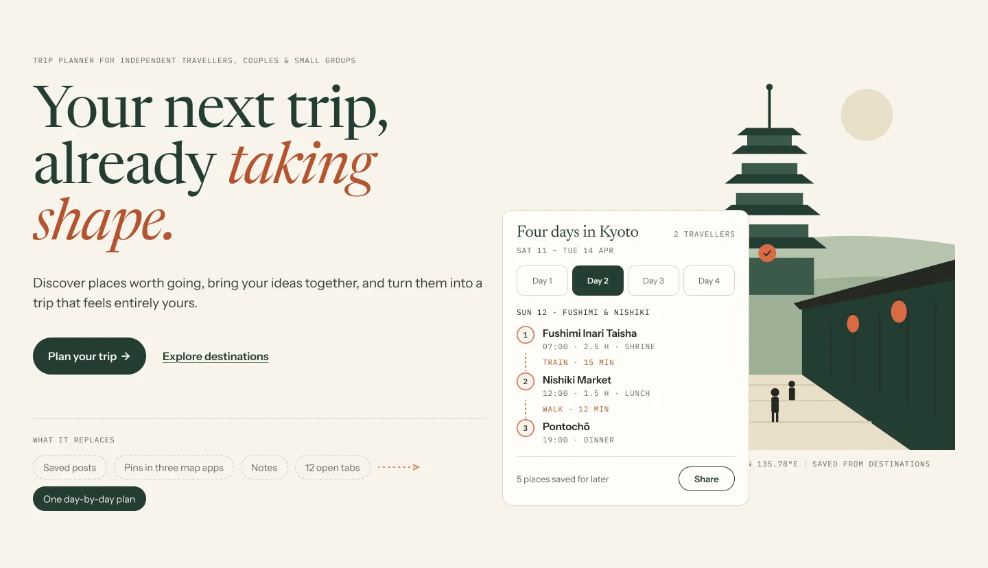
The homepage lists what the product replaces, in the user's own terms: saved posts, pins in three map apps, notes, twelve open tabs. Recognition does the selling before any feature is mentioned.
- 02
Show the output, not the tool
Rather than a feature list, the hero shows a finished plan: four days in Kyoto, two travellers, real places at real times. The promise in the headline is visible beside it.
- 03
Design the gaps between stops
The itinerary gives equal weight to travel between places, labelling each leg as train or walk with a duration. The gaps are where plans usually fall apart, so they are part of the interface rather than an afterthought.
- 04
Let saving stay loose
A counter holds places saved for later without forcing them into a day. Planning stays flexible, which is the whole point of independent travel.
Design system
Aa
Serif
Headlines, with italic for emphasis
Aa
Sans
Interface and body copy
Aa
Mono
Times, durations and labels
Final screens
Outcome
- Leading with what the product replaces turns a vague category into something people recognise from their own last trip.
- Showing a finished itinerary in the hero explains the product faster than any list of features.
- Treating travel between stops as first-class content addresses the part of planning that usually breaks.