No Fixed Form
An independent digital studio whose name is a promise the layout has to keep. The grid is strict, and the type deliberately refuses to sit in it.
The challenge
A studio called No Fixed Form cannot present itself on a conventional, obedient layout. But refusing structure usually just reads as broken. The problem was to make the refusal legible: visibly deliberate, not accidental, and still easy to read and navigate.
The approach
- 01
The grid as the subject
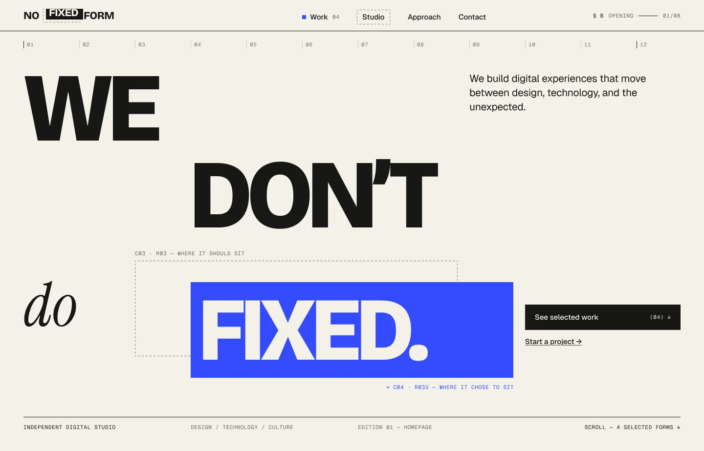
Rather than hiding the layout, the grid is drawn. Twelve numbered columns run across the top of the page, so the structure the design is breaking is visible before anything breaks it.
- 02
Breaking it on purpose
The word FIXED sits in a blue block pushed out of its cell, with a dashed outline left behind. Annotations name both positions: where it should sit, and where it chose to sit. The joke is labelled, so it reads as intent.
- 03
Type doing two jobs
A heavy grotesque carries the statement while a serif italic handles the small connecting word. The contrast keeps a four-word headline from feeling flat and reinforces the idea of mixed form.
- 04
Quiet interface, loud page
Navigation, counters and footer meta are set small in mono at a consistent rhythm. With the interface this restrained, the headline can be as large as it likes without the page becoming noisy.
Design system
Aa
Grotesque
Display headlines
Aa
Serif italic
Connecting words
Aa
Mono
Grid labels and meta
Final screens
Outcome
- The grid is the argument. Showing it, then breaking it in one controlled place, says more about the studio than a paragraph of positioning would.
- Labelling the break turns something that could look like a mistake into the clearest statement on the page.
- Holding the interface to small mono type leaves room for display type to be genuinely large without crowding.